I have a slate doc that needs some different behavior depending on the width of the user’s screen in pixels. AIP suggested calling window.innerWidth but that doesn’t seem available.
I dont think slate have built-in window.innerWidth option for above . Can achieve dynamic designs with Code Sandbox widget and custom CSS.
Please check the below thread. It may help ..
https://community.palantir.com/t/how-do-i-get-a-slate-to-take-the-full-screen-space/1524?utm_source=chatgpt.com
The dynamic design is no problem, but the requirement for what I’m building is different arrangements of widgets depending on the width of the screen. ie, if it is between 700 and 900 px, do X, etc.
there is a slate event to get a screen resize, but i’m not seeing any way to access what that size is.
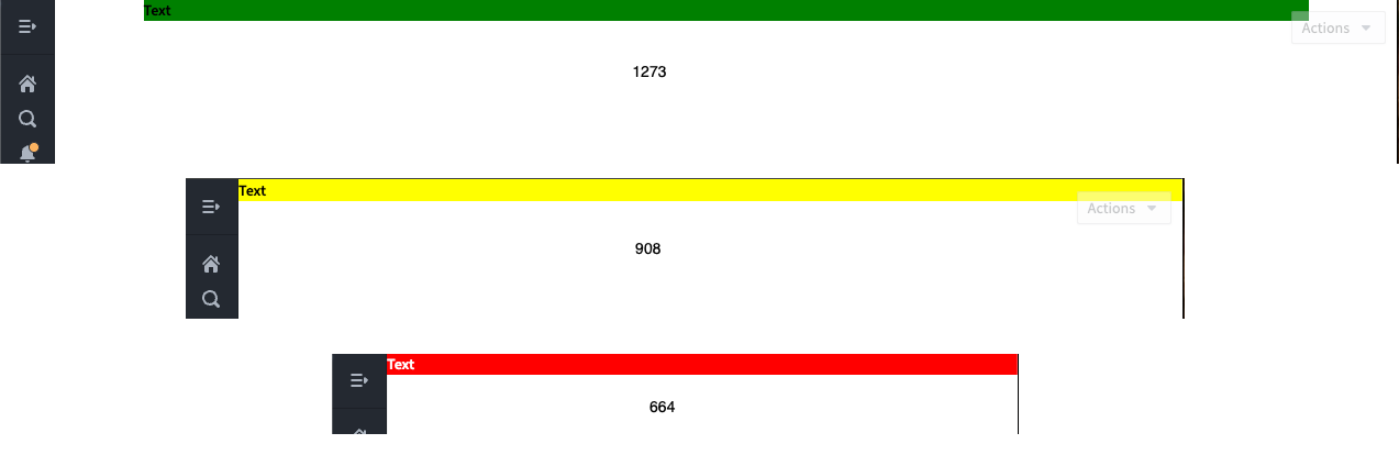
I feel like I’m close. I added the following css as a test and it DOES respond to changes in width but I can’t figure out the relationship between the width of my actual window and the numbers here…
// Custom width styles
/* Default styles for .custom-class */
.custom-class {
  background-color: lightblue;
  color: black;
}

/* Styles for .custom-class when the width is below 500px */
@media (max-width: 300px) {
  .custom-class {
    background-color: lightcoral;
    color: white;
  }
}

/* Styles for .custom-class when the width is above 500px */
@media (min-width: 2432px) {
  .custom-class {
    background-color: lightgreen;
    color: black;
  }
}
Indeed CSS is the right track to achieve this:
/* Default styles for .custom-class */
.custom-class {
  background-color: lightblue;
  color: black;
}

/* Styles for .custom-class when the width is below 700px */
@media (max-width: 700px) {
  .custom-class {
    background-color: red;
    color: white;
  }
}

/* Styles for .custom-class when the width is between 701px and 1024px */
@media (min-width: 701px) and (max-width: 1024px) {
  .custom-class {
    background-color: yellow;
    color: black;
  }
}

/* Styles for .custom-class when the width is above 1024px */
@media (min-width: 1025px) {
  .custom-class {
    background-color: green;
    color: black;
  }
}
2 Likes
This topic was automatically closed 14 days after the last reply. New replies are no longer allowed.